
AI Underwriting Assistant
Background
Hannover Re, the world’s third-largest reinsurer, processes thousands of medical and legal documents daily.To speed up underwriting, their data-science team built hr | mule, an AI assistant that classifies and summarises cases for human review.
My role was to redesign hr | mule to make it trustworthy, efficient, and usable for underwriters who depend on accuracy and speed.
My role was to redesign hr | mule to make it trustworthy, efficient, and usable for underwriters who depend on accuracy and speed.
The problem
Although hr | mule’s AI correctly predicted outcomes about 90 % of the time, underwriters often distrusted its results.
False positives led many to disable the tool and return to manual review.
False positives led many to disable the tool and return to manual review.
Key issues:
- Low trust - AI decisions felt opaque.
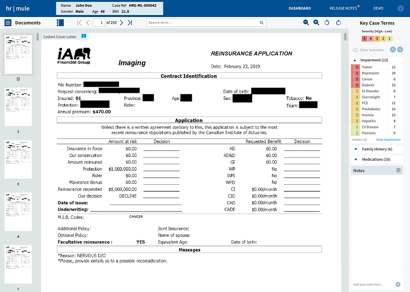
- Inefficient workflow - tiny viewports, cluttered widgets, no dual-screen flexibility.
- Poor UX fit - limited note-taking, confusing colour system, no feedback loop to train the model.
Process (Double Diamond, condensed)
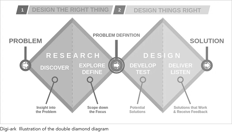
DISCOVER
User interviews, Data analysis
DEFINE
User journey mapping, Persona creation
DEVELOP
Wireframing, Prototyping
DELIVER
Usability testing, UI design
1. Discover - Define
- Conducted user interviews with 12 underwriters + 2 data scientists.
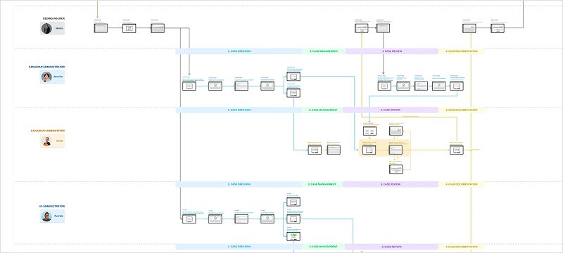
- Mapped the full underwriting journey using a service blueprint, revealing pain points, opportunities, and user personas.
- Created a user flow for the AI underwriting assistant, from the moment an underwriter receives a case to the moment they make a decision.
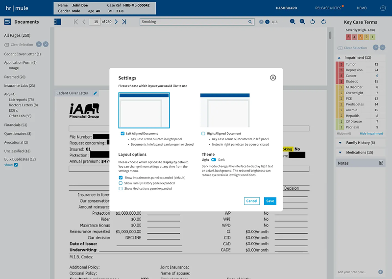
- Underwriters need space - Dual monitor layouts and resizable panels.
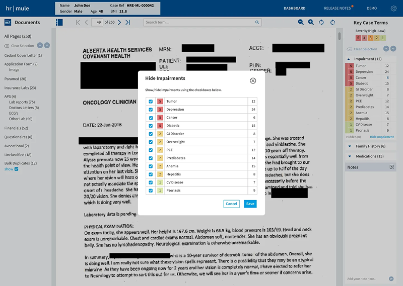
- Colour should indicate categories, not warnings.
- Notes are vital context; must persist and scale.
- Transparency + control = trust.
Underwriters need agency
Transparency builds trust
Feedback loop is essential
Show AI reasoning
2. Develop - Deliver
- Ran rapid ideation workshops in Figma; co-created early concepts with stakeholders.
- Iterated low → mid → high fidelity in weekly sprints.
- Tested two rounds remotely with 6 underwriters (Zoom + Figma prototype).
Wireframe Iterations
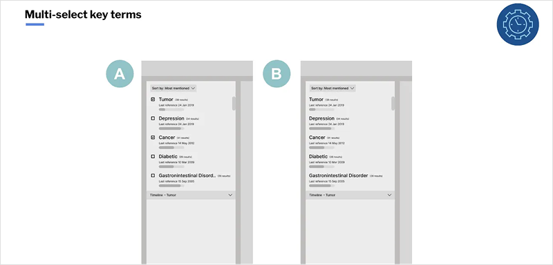
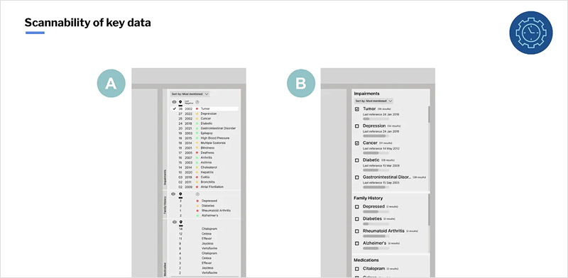
Key design moves:
- Simplified colour logic and improved hierarchy.
- Introduced AI confidence indicator with “Explain Decision” view.
- Added resizable document & note panels for dual monitors.
- Enabled inline feedback to retrain AI.
- Added dark mode and adjustable type for eye-strain relief.
Solution Highlights
- Trust through transparency - Contextual cues, clear reasoning, manual overrides.
- Faster reviews — Larger workspace, keyboard shortcuts, improved navigation.
- Persistent notes — Expandable drawer, tagging, shareable context.
- Continuous learning — Feedback loop to data-science team.
- Accessibility & customisation — Light/dark themes, flexible panes.
Impact
- +25 % faster average review time in pilot sessions.
- Underwriters reported higher confidence in AI-assisted decisions.
- Unified workflow adopted by US & Canadian teams.
- New component library documented for future features.
It finally feels like the tool works with us, not against us.
Reflection
Designing for AI in enterprise settings is as much about trust as it is about accuracy.
This project strengthened my ability to:
- Facilitate cross-disciplinary workshops across time zones.
- Translate technical AI concepts into understandable UI behaviours.
- Balance compliance, efficiency, and user empathy in a high-stakes domain.
Great UX for AI isn't about replacing people — it's about giving them confidence to make better decisions.
Let's connect
Shoot me a message here or connect with me on LinkedIn to get in touch.